Nailing the Design at butter LONDON’s Seattle Flagship
- By Shawn Williams

- Oct 9, 2017
- 2 min read
KNOWN FOR ITS CHIC NAIL POLISH COLORS AND PIONEERING EFFORTS TO CREATE A SAFER LACQUER FORMULA (without many of the harsh chemicals present in typical nail polishes), butter LONDON encapsulates Seattle’s individualist style and commitment to eco-friendly living. So when the company was ready to open its flagship nail bar and retail space, the Emerald City was top choice. Last month the 537-square-foot space opened in South Lake Union’s popular 400 Fairview building (designed by SkB Architects), and offers signature waterless manicures and pedicures, as well as the brand’s full makeup and nail product assortment. To design the space, butter LONDON president Sarina Godin tapped local interior designer Leah Steen to create a sassy, cocktail bar –inspired space.
“When we were developing the concept for the new store, we wanted to break the mold of traditional nail salons and create an unforgettable butter LONDON experience,” Godin says. “The nail bar is designed in a sophisticated palette of white, black, and soft peach – our core brand colors – and features modern brass fixtures. As a brand, we are pure, posh, and playful and we wanted to translate each of those elements into our flagship store.”
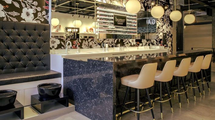
Starting with an empty shell, Steen worked closely with Method Construction on a build-out that would optimize the space for nail services and cosmetic shopping, while keeping a clean, modern aesthetic. Anchored by a “marble-look” laminate bar, concrete floors, and white laminate cabinetry lining the walls, the flagship’s character comes in the details. Most notable is the custom punk-infused (think crossbones and leopard-print butterflies) black-and-white floral wallpaper from HD Walls. Blush-tinted chairs from Richardson Seating match low stools made by an L.A.-based, to-the-trade resource called Showroom. Over the nail bar hang four Luna Pendants from Schoolhouse Electric—a go-to for Steen in both residential and commercial projects. Finishing off the cabinetry are both handles from Schoolhouse Electric and gold skull-shaped pulls from ModShop. “An important part of butter LONDON’s branding is their cheekiness and a little bit of edge,” Steen notes. “We thought these [skull pulls] were a great but subtle nod to that.”
Relying on the company’s mix of youthful branding and sophistication, Steen was able to tease out a flagship with wide appeal—from beauty junkies and design aficionados to those encountering the brand for the first time. “It was important for me to create a space that felt modern, feminine and hip,” Steen says, “but not so hip that it felt off-putting to ‘regular’ people like me.” The consensus is, she nailed it.


